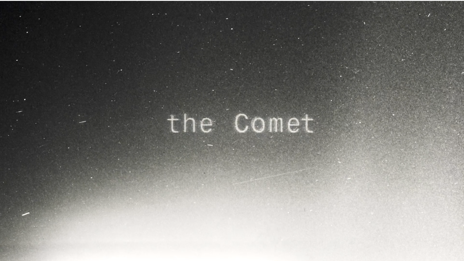
On San Francisco’s cold north shore, you’ll find an Art Deco museum shaped like a ship. In it, an exhibit of silver daguerreotype plates—the earliest form of photography. I stumbled upon it years ago and was haunted by the stares of long-deceased sailors.
Something about the use of metal and mercury has imprinted those images with a brushstroke of real humanhood. More so than any photo. The eyes quiver. I can’t explain it. And literally, I cannot show you, because you are viewing this on a digital screen.
Digital screens use an array of light-emitting diodes (LEDs) to construct a crude simulation of reality. We only think these displays are accurate because we are so used to them, and they're just convincing enough. If I hadn’t told you this, you’d probably see the below image and think, “Oh yes, I see the haunting eyes.” But you don’t. You can’t. And that is my point in today’s issue.

We are each perceiving the world differently on a number of perceptual spectra and don’t realize it. We are missing a phantasm of sensations and are uniquely privy to other rare, luminous shades. We each live on our individualized turn of the kaleidoscope. But, biases being what they are, we all tend to think of our default as everyone’s default.
Today, a few meditations on those differences as they relate to creative work, as I’ve come to understand them. And also, let’s talk about the beauty of those differences and what’s lost in the savage compression of computerized screens.
On visualization
Every year, video game developers pour into San Francisco for a conference. Fenwick's Co-Founder Eve and I struck up a conversation with one such attendee—Glenn Fiedler—at our neighborhood coffee shop. He’s among the world’s foremost experts in mass multiplayer game engines, and his descriptions of his latest project were rich with mechanical language. “But what does the game look like?” we asked. Whereupon Glenn laughed and explained that’s not his role. Also, he wouldn’t know. He doesn’t see visualizations. “Some people, you say, ‘picture a beach’ and they actually see that in their head,” he laughed. “Not me.” What does Glenn experience? He has those ideas, but conceptually. There is no mental picture. It is all abstract. A recent article in The New Yorker followed the story of a scientist who discovers this phenomenon for himself rather late in life, when reading instructions to “visualize” something. Never in his forty years had it occurred to him that people might actually mean it literally.
Let’s try it for ourselves. When you picture a beach, what do you see? People high in visualization find that the picture is consistent, persistent, and navigable. The more they look, the more detail they see. And it is fixed. They can return to the same setting and examine it. They can explore the environment. As one friend of mine explained, when asked to visualize an apple, she sees an exact apple in the room she last saw it. Change the apple and it changes the scene.
If we are friends, I’ve probably asked you about this because I’ve learned through this inquiry that I actually have quite poor visualization. Images for me are wraith-like apparitions; I see shards and aspects, but the more I focus, the greater the static. I think it helps explain why I was so obsessive about hyper-detailed pen-and-ink drawing as a child. I cannot recreate something unless I’m looking at it. I wanted so badly to keep those details.
It may go without saying, but where the brain forgoes one capacity, it acquires another. In Glenn’s case, he has a supernatural understanding of game software architecture and networking. And he partners with talented artists deep in storytelling and environment.
On color
Open any design software and you’ll be presented with a color picker—typically, a square or circle. I got to thinking recently, what are the odds that all colors in existence actually fit on this wheel? And of course, they don’t. For one, colors aren’t real—they’re a sensation we experience. And two, we each experience a very different range of color sensations.
A more accurate map of colors requires three dimensions for value, hue, and chroma. It looks more like the below.
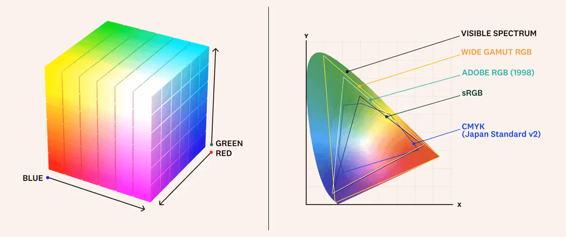
Note that not all colors are equal. Some have more variants. Yellow is relatively flat, whereas red and green contain more diversity.
All of this is an artifact of our evolutionary history: Color vision is genetically determined. Most people have three “cones” in their eyes, which allow them to see one million colors. But some are missing a cone or it's mutated, and they see as few as 10,000 colors, as a barista at my local coffee shop discovered when his girlfriend informed him the blue shoes he bought are, in fact, green. These folks are living in a world that to most of us would seem sepia or cyan.
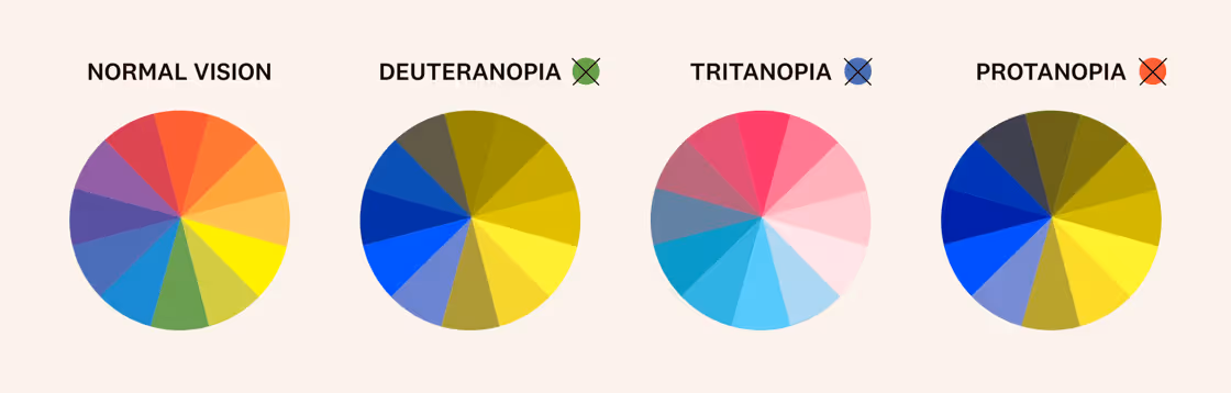
Whereas some people have a fourth color cone—orange.
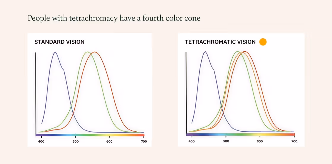
This is a mutation known as tetrachromacy, and it’s estimated that 12% of the women in Northern UK have it. As a result, they can see 100 million colors. For every color someone with standard sight sees, they see 100 times more gradation.
Living with Eve, I can tell you she experiences something very much like this. It happens in obvious ways, like how I only accepted her verdict that my black shirt is, in fact, blue by examining it under very intense light. And it happens in subtle ways: She is more taken with living scenes of beauty and visual art, and less convinced by paintings that attempt photorealism.
Part of what fascinates me here ties back to my daguerreotype story: Most people go their whole life without knowing their unique brand of perceptual difference. It’s just our baseline reality. And digital technology is reducing the odds we ever find out. You cannot test for tetrachromacy except by DNA sequencing because, how would you? Your laptop screen’s LEDs have three colors: red, green, and blue. These combinations simulate reality, but fall short. This is why your phone always fails to capture sunsets.
Couldn’t you test with printed materials? There too, we run into constraints—most printers mix cyan, magenta, yellow, and black inks, which again limits the colors available. They miss the true spectra of light sensation.
In other words, it’s wonderful that we can all now see and share photos of those metal plates I found in the museum. But their eyes do not quiver with the brushstroke of humanhood unless we close our screens.
There is beauty in difference
I’m coming to appreciate that “accessibility” is important on more dimensions than I ever realized, and that the clarity I so prize in writing is frustratingly relative. I know I assume most people are persuaded first by logic, prefer to read, and love schematics as much as I. But I’m now taken with just how hard a twist some people’s kaleidoscopic experience is from mine. What can I adjust when the reader’s frame is not one twist away, but two or three?
Further, what is lost when we communicate within the stark austerity of LED screens? What uniqueness gets flattened into beige paste? Does our pursuit of universal clarity come at the expense of creativity? What avenues of thought do digital screens close to us forever?
I am heartened that the “kaleido” in kaleidoscope is Greek for “beautiful shape.” There is beauty in all that visual and cognitive diversity, which humanity risks losing if we aren’t made aware of it. If you take anything away from this, I hope it confirms your suspicions that you’re seeing things differently. And that other people’s reflections of that truth are not reality.
Pixels, no matter how cleverly arranged, will never stand in for the boreal rays of an opalescent sunset.
Schedule time to paint something real. With physical paint. Why? Great painters know that the ocean, in fact, ranges from woody green to chalky grey, and skies are a phantasma of mixed hues. Attempting to translate all that into a flat image will leave you forever impressed with all that goes uncaptured.

Inspiring principle: Active Awareness
Self-awareness is paramount to the way we work. We can only make meaning in a place of honest inquiry. We cultivate this awareness in ourselves and seek it in others.
Inside Fenwick
Speaking of color perception, babies see black and white, and not very well for their first year. This is top of mind because Eve and I had a baby boy, Alister, in November, and he’s an unspeakable joy.

Worth reading
The geometry of color. A stunning 20-minute romp through all the ways color pickers fail us. Nobody actually knows a good way to represent all the colors.
Some people can’t see images. Though when asked to recall the number of windows on a building, they can indeed count them. So those images are with them somewhere. A fascinating read.
News that can’t be bot. Clever copy, no?
Let’s stop saying “all-in-one.”
Art that was made by a human. Featuring Lope Gutiérrez-Ruiz, an Austin artist you should know.
Artist corporations.
“Just-so stories.” Follow Kerry Cunningham. He’s a rare B2B marketing thinker drawing from a vast array of disciplines, including literature and history. (This article is based on an idea from Rudyard Kipling.)